New Visual Identity for Výstaviště Praha Co-Designed by Tereza Hejmová from FFA BUT
Výstaviště Praha, one of the city's most iconic public venues, is undergoing a significant transformation, reflected in the launch of its new visual identity. The visual identity was created by the design team of Tereza Hejmová, Štěpán Malovec, and Martin Odehnal, whose concept was selected as the winning proposal in a two-round invited competition organized by CZECHDESIGN. Their approach impressed the expert jury with its conceptual depth, clarity, and adaptability to the diverse activities and functions of the site.
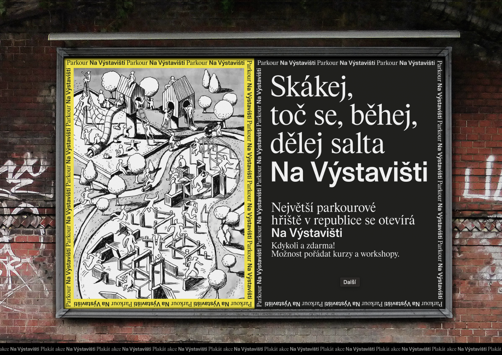
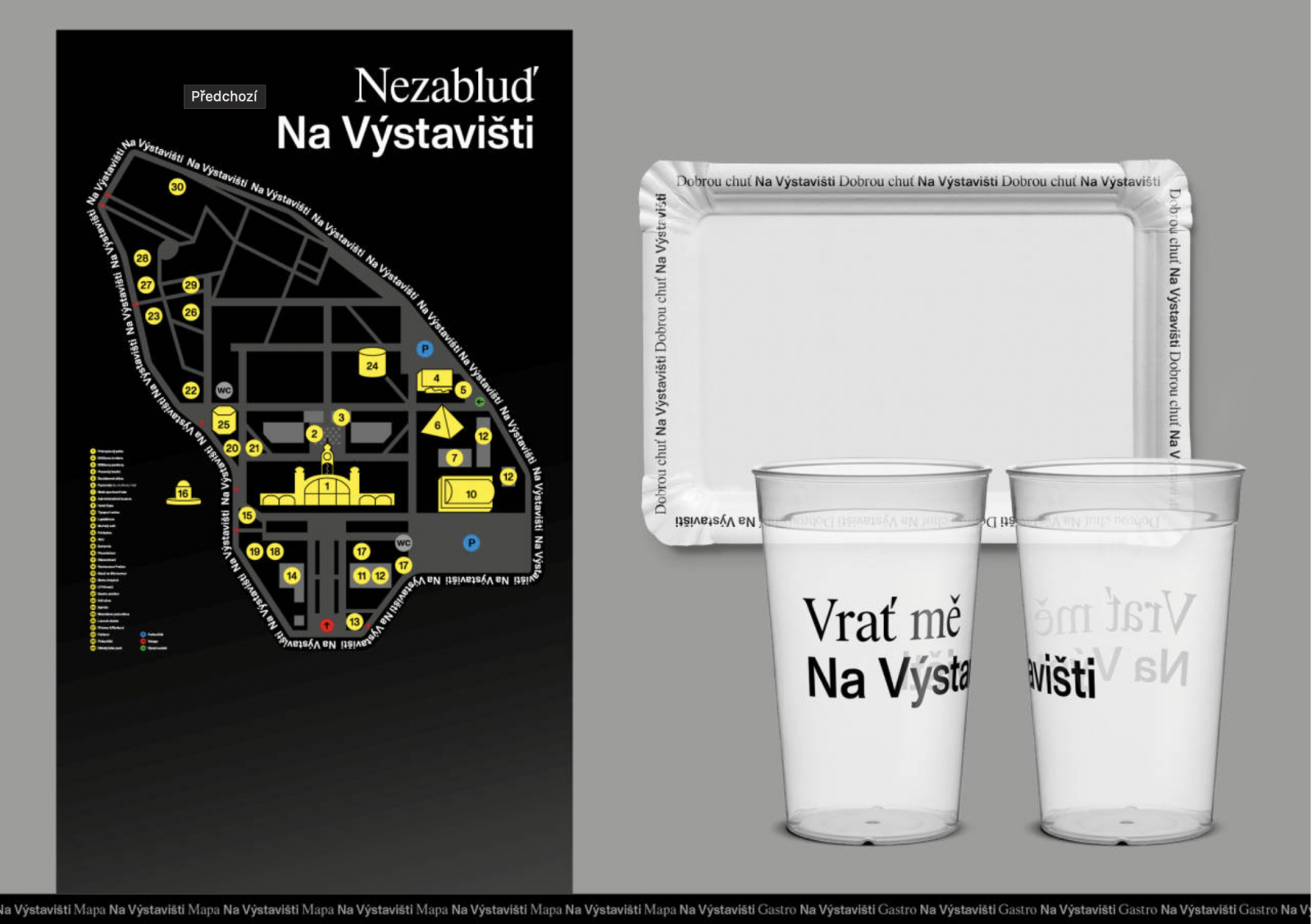
At the core of the new identity is a simple yet powerful idea: reinterpreting the traditional name “Výstaviště” by turning it into a location-specific expression through the addition of the preposition “Na” (“at”), forming the phrase Na Výstavišti (At the Exhibition Grounds). This allows the identity to function as a flexible linguistic and visual system—Festival na Výstavišti, Relaxujte na Výstavišti, Sejdeme se na Výstavišti—that speaks directly to the public in a dynamic and relatable way. The visual style is anchored in a dual-typeface combination—Rhymes (serif) and Monument (sans serif)—and is designed to evolve through ongoing collaborations with photographers, illustrators, and other creatives. The identity is being applied across signage, navigation, print, and digital communication, supporting the revitalization of the area, which includes upgraded infrastructure, a richer event programme, and improved amenities.
The project was nominated for the Czech Grand Design Award in the Graphic Designer of the Year category, recognizing its innovative concept, visual strength, and broad communicative impact.
More info:
Na Výstavišti on Czechdesign.cz
Výstaviště Praha on Font.cz

| Published | |
|---|---|
| Short URL | https://www.favu.vut.cz/en/rad/awards-recognition/f91716/d289112 |
Responsibility: doc. MgA. Filip Cenek